Email Marketing for Car Dealerships: Strategies, Ideas & Best Practices
Explore powerful email marketing strategies for car dealerships. Learn to attract, engage, and convert leads into loyal customers with ease.
Choosing the Best Font For Emails is essential for improving readability, engagement, and brand perception. The right font ensures that your emails look professional, are easy to read, and remain visually appealing across various devices and email clients. Poor font choices can result in low readability, a negative brand impression, and reduced email effectiveness.
This guide will help you understand:
✅ Why the right email font matters
✅ The best web-safe and custom fonts for emails
✅ How to choose the perfect font for your brand
✅ Common mistakes to avoid when selecting fonts
Let’s explore the best fonts for emails and how to optimize typography for email marketing success!
Fonts play a critical role in email marketing. The wrong choice can make emails hard to read, unprofessional, or even unrenderable on certain email clients. Here’s why picking the right font is crucial:
A good email font enhances readability and ensures recipients can easily scan and absorb the content. Well-spaced, clean fonts make emails accessible to all readers, including those using assistive technologies.
Your font choice should reflect your brand personality. A luxury brand may prefer a classic serif font, while a modern tech company may opt for a sleek sans-serif typeface to maintain brand identity.
Not all fonts render properly on all email clients (Outlook, Gmail, Apple Mail, etc.). Using standard web-safe fonts ensures your email remains consistent across platforms, reducing formatting issues.
Fonts impact how people engage with your email. Clear, visually appealing fonts encourage longer reading times, boosting click-through rates (CTR) and conversions.
Before choosing a font, it’s important to understand the two primary categories of fonts used in emails:
Web-safe fonts are pre-installed on most devices and email clients, ensuring consistent rendering. These include Arial, Times New Roman, Georgia, and Verdana.
Custom fonts provide unique branding but require embedding techniques like CSS or image-based text, which may not always display correctly in email clients. Google Fonts like Roboto and Montserrat offer excellent alternatives.
Choosing the right font for your emails plays a crucial role in readability, professionalism, and brand perception. Whether you’re sending corporate emails, newsletters, or promotional content, selecting the right font ensures a seamless reading experience across different devices and email clients. Below is a list of the best web-safe fonts and Google fonts for emails, categorized based on readability, style, and purpose.
Web-safe fonts are pre-installed on most operating systems and email clients, ensuring consistent rendering and accessibility.
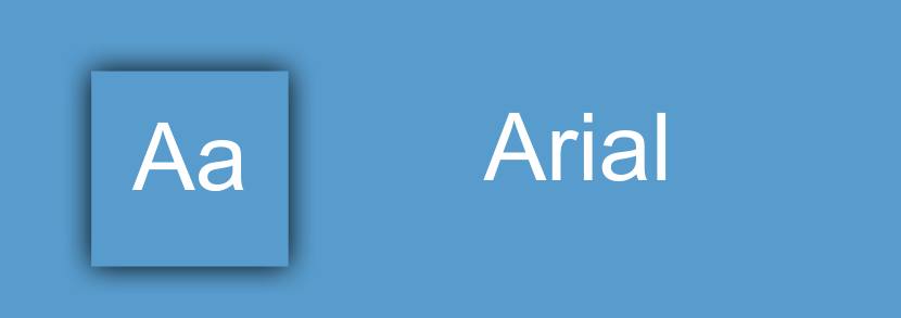
A clean, sans-serif font known for its simplicity and professional appeal. Arial is widely used across industries due to its high readability and compatibility with all major email clients. It’s an excellent choice for general business communication, newsletters, and corporate branding.
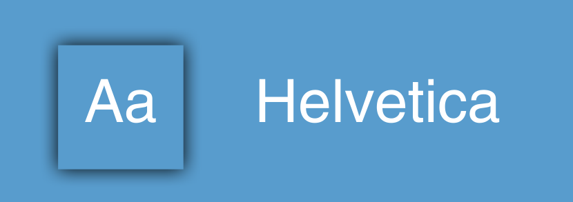
A modern and highly legible font that adds a touch of sophistication to emails. Popular among designers and corporate professionals, Helvetica is ideal for emails that require a sleek, minimalist, and authoritative look. It’s often used in tech and finance sectors.
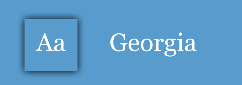
A serif font with a classic, elegant touch. Georgia is great for business and formal emails, offering a refined and polished look. Its strong readability on digital screens makes it suitable for content-heavy emails and legal or editorial communications.
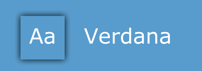
Specifically designed for digital screens, Verdana offers wide letter spacing and high readability. It’s a great choice for mobile-optimized emails, ensuring a clean and easy-to-read layout on all devices. It’s commonly used in customer service emails and accessibility-focused content.
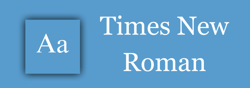
A timeless serif font, widely used in professional and formal settings. It’s a go-to option for legal documents, corporate communications, and traditional business emails where a classic, authoritative tone is required.
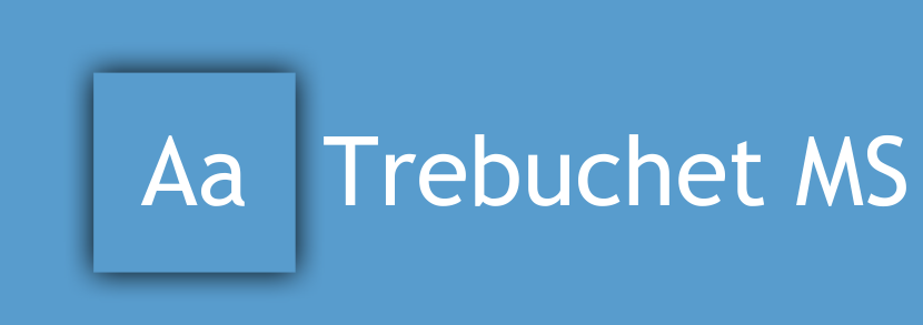
A friendly and modern sans-serif font that adds personality to emails. Trebuchet MS works well for creative brands, digital marketing, and newsletters that require an engaging yet professional look.
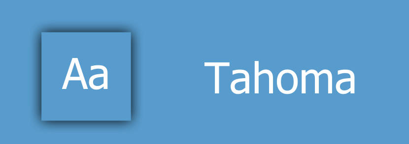
A compact, well-spaced sans-serif font optimized for mobile-friendly emails. With its excellent screen readability, Tahoma is ideal for email content that needs a structured, clear, and easy-to-digest appearance.
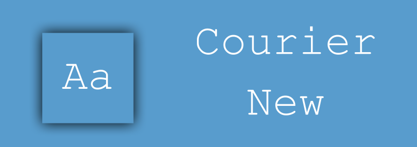
A monospaced, typewriter-style font that gives a distinctive, old-school feel. It’s mainly used in coding-related emails, developer communications, or informal messages where a retro or technical aesthetic is needed.
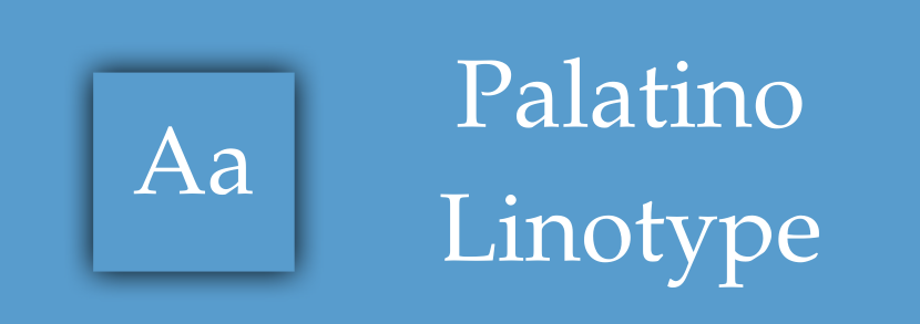
A stylish serif font with an elegant and luxurious appeal. Frequently used in creative and high-end industry emails, Palatino Linotype adds a sophisticated touch, making it ideal for branding, fashion, and artistic content.
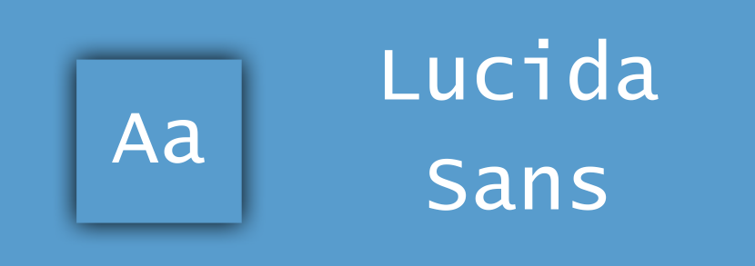
A clean and simple sans-serif font that ensures clarity across different screen sizes. Lucida Sans is great for professional and business emails, offering a neutral and highly legible appearance.
These fonts are not pre-installed on devices but can be embedded in emails via Google Fonts. They offer a more modern, customized look for branding and marketing campaigns.

A versatile, highly readable sans-serif font with a neutral yet modern appearance. It’s widely used in professional and casual emails, making it an excellent choice for newsletters, blogs, and general business communications.
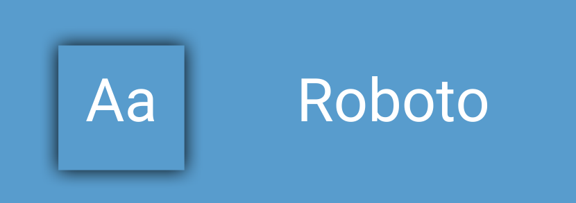
A sleek and structured sans-serif font commonly used in the tech and corporate world. Roboto provides a clean and polished look, making it perfect for startups, software companies, and digital marketing emails.
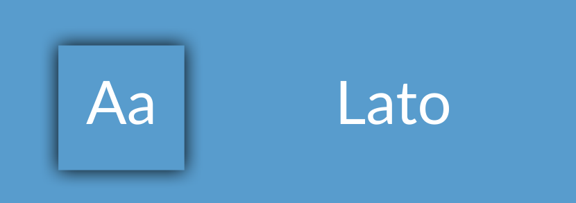
A friendly and elegant font with a touch of warmth. Lato works well for casual brands and businesses looking to create a professional yet approachable feel in their emails. It’s widely used in personal branding and lifestyle industries.
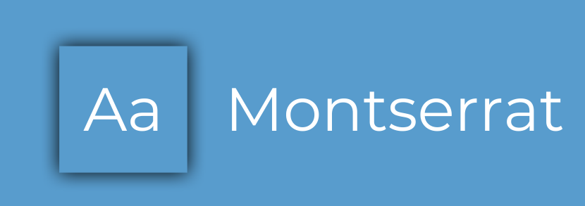
A bold and stylish font often used in headers and branding. Montserrat is ideal for marketing emails, promotional banners, and businesses that want a modern, eye-catching look.
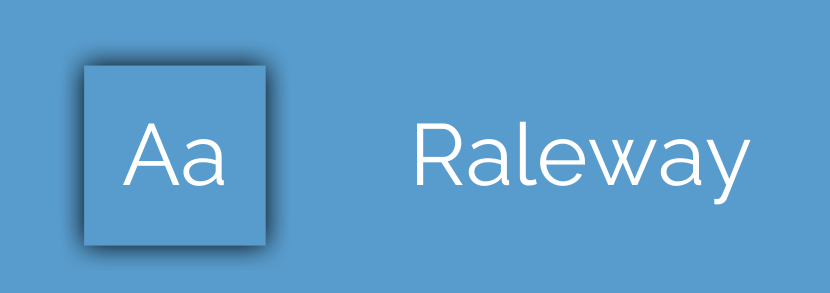
A sleek and sophisticated font that enhances minimalist design. It’s perfect for luxury brands, fashion, and high-end business emails where elegance and clarity are key.

A chic serif font that exudes class and refinement. This typeface is great for luxury brands, fashion, and email campaigns targeting high-net-worth clients. It pairs beautifully with sans-serif body text for an elegant contrast.
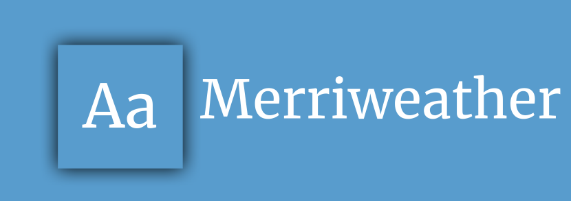
Designed specifically for digital readability, Merriweather is an excellent choice for long-form email content. Its serif style adds professionalism, making it great for editorial, academic, and corporate communications.
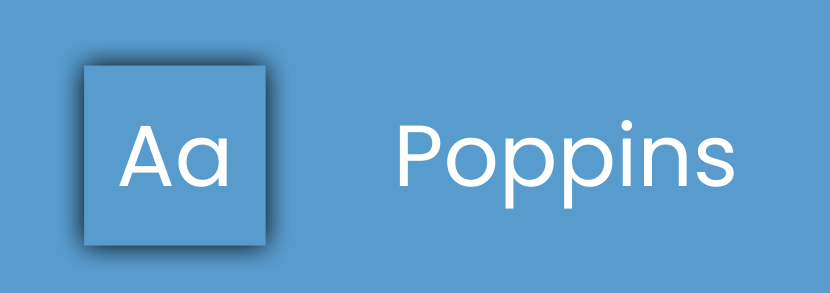
A modern, geometric sans-serif font with a professional appeal. Poppins is commonly used in corporate and business emails due to its clean and structured look.
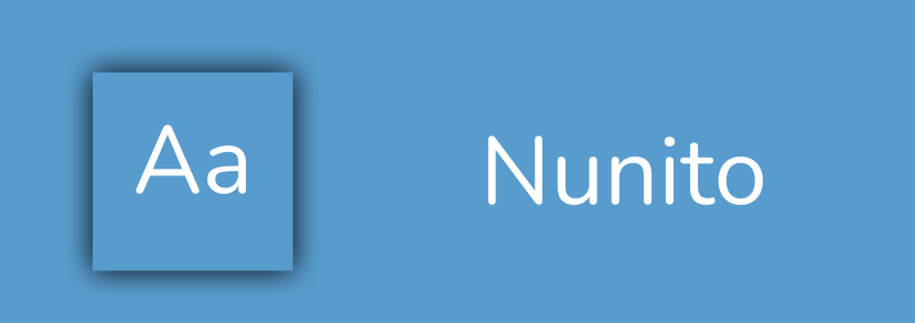
A rounded sans-serif font that brings warmth and friendliness to emails. It’s well-suited for brands that want to create an inviting, personal connection with their audience.
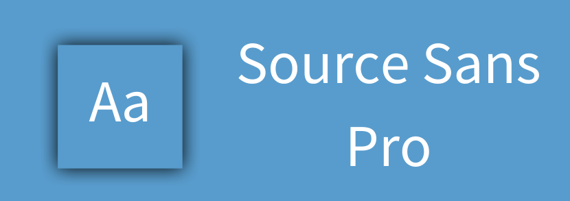
A highly versatile and well-balanced font, Source Sans Pro is widely used in professional email layouts. It provides a modern, easy-to-read structure, making it a great choice for startups, finance, and corporate brands.
Avoid overly decorative or script fonts as they are hard to read in emails. Stick to simple, clean typefaces that enhance readability.
Not all fonts work on every email client. Stick to web-safe fonts or test custom fonts before using them.
Check font appearance on mobile, tablet, and desktop to ensure a consistent user experience.
Use contrasting fonts for headers and body text to improve readability. For example:
✔️ Montserrat (Header) + Open Sans (Body)
✔️ Raleway (Header) + Lato (Body)
Use bold headlines and simple body fonts to enhance readability.
✅ Best Font Sizes:
✅ Line Spacing:
✅ Do’s & Don’ts:
✔️ Keep paragraphs short
✔️ Use contrast for readability (dark text on light background)
❌ Avoid using too many fonts (Stick to 1-2 max)
❌ Using Too Many Fonts in One Email – This creates inconsistency and visual clutter. Stick to one or two fonts for a clean look.
❌ Choosing Fonts That Don’t Render Properly – Some email clients block custom fonts, causing fallback issues. Always test before sending.
❌ Not Testing Readability on Mobile – Over 60% of emails are read on mobile devices. Always preview your email font size and spacing on small screens.
Discover the top 20 email fonts and learn how to choose the right one to enhance readability, branding, and audience engagement.
Selecting the best font for emails is key to delivering clear, engaging, and visually appealing messages. Whether you choose web-safe fonts for reliability or Google Fonts for branding, it’s important to test for readability across devices.
With Gofraze, an advanced email marketing platform, you can create stunning, optimized emails with built-in font customization and ready-to-use email templates. Gofraze ensures your emails look professional across all devices and clients, helping improve email engagement and conversions.
Try Gofraze today to take your email marketing to the next level!

Explore powerful email marketing strategies for car dealerships. Learn to attract, engage, and convert leads into loyal customers with ease.

Learn how to craft the perfect webinar invitation email using key tips, templates, and examples to boost sign-ups and engagement.

Discover winning sports newsletter examples, essential elements, and expert tips to craft high-impact email campaigns your fans will love.
Get unlimited forms that turn your traffic into real subscribers — totally free
Start now - free forever